New Versions of Premium Fonts
I have just updated all 54 regular fonts in the Premium Fonts collection (and subscription) to version 1.5. Aside from a few changes to meta data, the main update is the addition of kerning to all 54 fonts.
If you have no idea what I am talking about, you can see an example of the difference kerning makes in the Comicopia font below:
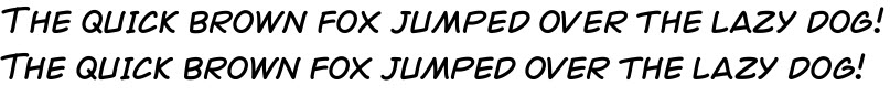
The top example shows the sentence using Comicopia font without any kerning. The bottom sentence includes kerning. When creating fonts, the spacing between characters is not always natural looking; many letter combinations (for example,”ow” and “wo”) tend to look further away then other letter combinations. Above, you can also see this with the uppercase “T” next to the “h” at the beginning of each sentence. By kerning fonts you can tell the font to automatically adjust the spacing between specific character combinations (also called kern pairs).
Apple supplies kerning features by default in most of its applications, and makes it easy for third party app publishers to also included kerning features. This makes adding kerning to fonts more of a bonus rather than a necessity. To kern text in TextEdit for example, highlight text then select the kern option you want by navigating the following menu option:
Format | Font | Kern
Let me know if you have any questions about the Kern feature!